Celebrating over 27 years as Heather James: A Conversation with the Owners
  • PD-slider1
  • JAC-slider1

ABOUT HEATHER JAMES FINE ART

Heather James Fine Art presents a rare look into art history’s past and present, offering important works from a cross-section of periods, movements, and genres including Post-War, Contemporary, Impressionist, Modern, American, Latin American, and Old Masters.

For over 27 years, Heather James Fine Art has expanded into a global network with galleries located in Palm Desert, California, and Jackson Hole, Wyoming along with consultancies in New York City, London, Los Angeles, San Francisco, Montecito, and Lake Como, Italy. Each year, its galleries present an array of museum-quality exhibitions exploring historical and contemporary themes, or examining the work of individual influential artists.

Heather James Fine Art is dedicated to bringing exceptional art to private clients and museums globally while providing the utmost personalized logistical, curatorial, and financial services.

GALLERIES

CONSULTANCIES

GET TO KNOW US

SERVICES

Heather James Fine Art provides a wide range of client-based services catered to your specific art collecting needs. Our Operations team includes professional art handlers, a full registrar department and logistical team with extensive experience in art transportation, installation, and collection management. With white glove service and personalized care, our team goes the extra mile to ensure exceptional art services for our clients.

  • home-services
  • Svc_hirst
  • Services-brian1
  • Svc_Warhol
  • Svc_kapoor

GALLERY TOURS

FEATURED ART

Cottonwood Tree (Near Abiquiu), New Mexico (1943) by celebrated American artist Georgia O’Keeffe is exemplary of the airier, more naturalistic style that the desert inspired in her. O’Keeffe had great affinity for the distinctive beauty of the Southwest, and made her home there among the spindly trees, dramatic vistas, and bleached animal skulls that she so frequently painted. O’Keeffe took up residence at Ghost Ranch, a dude ranch twelve miles outside of the village of Abiquiú in northern New Mexico and painted this cottonwood tree around there. The softer style befitting this subject is a departure from her bold architectural landscapes and jewel-toned flowers.
<br>
<br>The cottonwood tree is abstracted into soft patches of verdant greens through which more delineated branches are seen, spiraling in space against pockets of blue sky. The modeling of the trunk and delicate energy in the leaves carry forward past experimentations with the regional trees of the Northeast that had captivated O’Keeffe years earlier: maples, chestnuts, cedars, and poplars, among others. Two dramatic canvases from 1924, Autumn Trees, The Maple and The Chestnut Grey, are early instances of lyrical and resolute centrality, respectively. As seen in these early tree paintings, O’Keeffe exaggerated the sensibility of her subject with color and form.
<br>
<br>In her 1974 book, O’Keeffe explained: “The meaning of a word— to me— is not as exact as the meaning of a color. Color and shapes make a more definite statement than words.” Her exacting, expressive color intrigued. The Precisionist painter Charles Demuth described how, in O’Keeffe’s work, “each color almost regains the fun it must have felt within itself on forming the first rainbow” (As quoted in C. Eldridge, Georgia O’Keeffe, New York, 1991, p. 33). As well, congruities between forms knit together her oeuvre. Subjects like hills and petals undulate alike, while antlers, trees, and tributaries correspond in their branching morphology.
<br>
<br>The sinewy contours and gradated hues characteristic of O’Keeffe find an incredible range across decades of her tree paintings. In New Mexico, O’Keeffe returned to the cottonwood motif many times, and the seasonality of this desert tree inspired many forms. The vernal thrill of new growth was channeled into spiraling compositions like Spring Tree No.1 (1945). Then, cottonwood trees turned a vivid autumnal yellow provided a breathtaking compliment to the blue backdrop of Mount Pedernal. The ossified curves of Dead Cottonweed Tree (1943) contain dramatic pools of light and dark, providing a foil to the warm, breathing quality of this painting, Cottonwood Tree (Near Abiquiu). The aural quality of this feathered cottonwood compels a feeling guided by O’Keeffe’s use of form of color.

GEORGIA O'KEEFFE


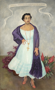
<br>In Diego Rivera’s portrait of Enriqueta Dávila, the artist asserts a Mexicanidad, a quality of Mexican-ness, in the work along with his strong feelings towards the sitter. Moreover, this painting is unique amongst his portraiture in its use of symbolism, giving us a strong if opaque picture of the relationship between artist and sitter.
<br>
<br>Enriqueta, a descendent of the prominent Goldbaum family, was married to the theater entrepreneur, José María Dávila. The two were close friends with Rivera, and the artist initially requested to paint Enriqueta’s portrait. Enriqueta found the request unconventional and relented on the condition that Rivera paints her daughter, Enriqueta “Quetita”. Rivera captures the spirit of the mother through the use of duality in different sections of the painting, from the floorboards to her hands, and even the flowers. Why the split in the horizon of the floorboard? Why the prominent cross while Enriqueta’s family is Jewish? Even her pose is interesting, showcasing a woman in control of her own power, highlighted by her hand on her hip which Rivera referred to as a claw, further complicating our understanding of her stature.
<br>
<br>This use of flowers, along with her “rebozo” or shawl, asserts a Mexican identity. Rivera was adept at including and centering flowers in his works which became a kind of signature device. The flowers show bromeliads and roselles; the former is epiphytic and the latter known as flor de jamaica and often used in hibiscus tea and aguas frescas. There is a tension then between these two flowers, emphasizing the complicated relationship between Enriqueta and Rivera. On the one hand, Rivera demonstrates both his and the sitter’s Mexican identity despite the foreign root of Enriqueta’s family but there may be more pointed meaning revealing Rivera’s feelings to the subject. The flowers, as they often do in still life paintings, may also refer to the fleeting nature of life and beauty. The portrait for her daughter shares some similarities from the use of shawl and flowers, but through simple changes in gestures and type and placement of flowers, Rivera illuminates a stronger personality in Enriqueta and a more dynamic relationship as filtered through his lens.
<br>
<br>A closer examination of even her clothing reveals profound meaning. Instead of a dress more in line for a socialite, Rivera has Enriqueta in a regional dress from Jalisco, emphasizing both of their Mexican identities. On the other hand, her coral jewelry, repeated in the color of her shoes, hints at multiple meanings from foreignness and exoticism to protection and vitality. From Ancient Egypt to Classical Rome to today, coral has been used for jewelry and to have been believed to have properties both real and symbolic. Coral jewelry is seen in Renaissance paintings indicating the vitality and purity of woman or as a protective amulet for infants. It is also used as a reminder, when paired with the infant Jesus, of his future sacrifice. Diego’s use of coral recalls these Renaissance portraits, supported by the plain background of the painting and the ribbon indicating the maker and date similar to Old Master works.
<br>
<br>When combined in the portrait of Enriqueta, we get a layered and tense building of symbolism. Rivera both emphasizes her Mexican identity but also her foreign roots. He symbolizes her beauty and vitality but look closely at half of her face and it is as if Rivera has painted his own features onto hers. The richness of symbolism hints at the complex relationship between artist and sitter.

DIEGO RIVERA

Led by a triumvirate of painters of the American Scene, Thomas Hart Benton, John Steuart Curry, and Grant Wood took on the task of exploring, defining, and celebrating the Midwest as a credible entity within the geographical, political, and mythological landscape of the United States. Their populist works were figurative and narrative-driven, and they gained widespread popularity among a Depression-weary American public. The landscapes Grant Wood painted, and the lithographs marketed by Associated American Artists were comforting reminders of traditional Midwestern values and the simplicity of country life. Yet, Wood's most iconic works, including American Gothic, were to be viewed through the lens of elusive narratives and witty ironies that reflect an artist who delighted in sharing his charming and humorous perspective on farm life. 
<br>
<br>In 1930, Wood achieved national fame and recognition with American Gothic, a fictionalized depiction of his sister, Nan, and his family dentist. Frequently regarded as the most famous American painting of the twentieth century, to fully grasp American Gothic's essential nature, one must recognize Wood's profound connection to his Iowan roots, a bond that borders on a singular fixation and the often-brutal confrontation between the moral and cultural rigidity of Midwest isolationism and the standards that prevailed elsewhere in America. This war of values and morality became dominant throughout Wood's oeuvre. Their fascination with American Gothic may have mystified the public, but the story, told in the attitude of a farmer and his wife, is as lean and brittle as the pitchfork he carries. Their attitude, as defiant as it is confrontational, is an unflinching dare to uppity gallery-goers to judge their immaculate well-scrubbed farm. American Gothic became an overnight sensation, an ambiguous national icon often interpreted as a self-effacing parody of midwestern life. Yet it also served as an unflinching mirror to urban elite attitudes and their often-derisive view of heartland values and way of life. In Grant Wood's hands, the people of the Midwest have stiffened and soured, their rectitude implacable.
<br> 
<br>Portrait of Nan is Grant Wood's most intimate work. He may have been motivated to paint it to make amends for the significant scrutiny and harsh treatment his sister received as American Gothic's sternly posed female. Grant poured his heart into it as a sign of sibling love. Intent upon painting her as straightforward and simply as possible so as not to invite unintended interpretations, Wood's deep attachment to the portrait was significant enough for him to think of it as having irreplaceable value. When he moved from Cedar Rapids to Iowa City in 1935, he designed his entire living room around the work. It occupied the place of honor above the fireplace and was the only painting he refused to sell. 
<br> 
<br>The lithograph July Fifteenth, issued in 1938, proves his mystical vision of the Iowan heartland is anything but a pitchfork approach. Drawings assumed central importance in Wood's output, and this work is executed in meticulous detail, proving his drawings were at least as complex, if not more so, than his paintings. The surface of the present work takes on an elaborate, decorative rhythm, echoed throughout the land that is soft, verdant, and fertile. Structurally, it alludes in equal measure to the geometry of modern art and the decorative patterning of folk-art traditions. This is a magical place, a fulsome display of an idealized version of an eternal, lovely, and benign heartland. 
<br>
<br>The Young Artist, an en plein air sketch, may have been produced during, or slightly after, what Wood called his "palette-knife stage" that consumed him in 1925. Having not yet traveled to Munich where, in 1928, he worked on a stain-glass window commission and came under the influence of the Northern Renaissance painters that sparked his interest in the compositional severity and detailed technique associated with his mature works, here, he worked quickly, and decisively. The view is from a hilltop at Kenwood Park that overlooks the Cedar River Valley near Cedar Rapids, where he built a house for his sister, Nan.

GRANT WOOD

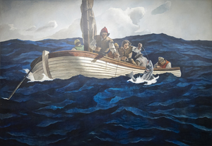
According to the catalogue raisonné compiled by The Brandywine River Museum of Art, the preliminary drawing for Puritan Cod Fishers was completed by N. C Wyeth prior to his death in October 1945. The entry records an image of the sketch as well as the artist’s inscriptions and its title, Puritan Cod Fishers, characterized by the catalogue as ‘alternate’. In either case, the large-scale canvas is a unique work that Andrew Wyeth later recalled was painted solely by his hand, a demarcated collaboration of the father’s design and composition brought to fruition by a remarkable son’s execution. For Andrew, it must have been a deeply felt and emotional experience. Given his father’s attention to detail and authenticity, the lines of the small sailing craft represent a shallot, in use during the sixteenth century. On the other hand, Andrew likely deepened the hues of the restless sea more so than his father might have, a choice that appropriately heightens the perilous nature of the task.

Andrew Wyeth & N. C. Wyeth

Alexander Calder was a key figure in the development of abstract sculpture and is renowned for his groundbreaking work in kinetic art; he is one of the most influential artists of the Twentieth Century. "Prelude to Man-Eater" is a delicately balanced standing sculpture that responds to air currents, creating a constantly changing and dynamic visual experience.
<br>
<br>Calder's Standing Mobiles were a result of his continuous experimentation with materials, form, and balance. This Standing Mobile is a historically significant prelude to a larger work commissioned in 1945 by Alfred Barr, the first director of the Museum of Modern Art in New York. "Prelude to Maneater" is designed to be viewed from multiple angles, encouraging viewers to walk around and interact with it.
<br>
<br>The present work is a formal study for Man-Eater With Pennant (1945), part of the permanent collection of the Museum of Modern Art in New York. The work is also represented in "Sketches for Mobiles: Prelude to Man-Eater; Starfish; Octopus", which is in the permanent collection of the Harvard Fogg Museum.
<br>
<br>Calder's mobiles and stabiles can be found in esteemed private collections and the collections of major museums worldwide, including the Museum of Modern Art in New York, the National Gallery of Art in Washington, D.C., the Whitney Museum of American Art, New York, the Art Institute of Chicago, and the Tate Gallery in London among others.

ALEXANDER CALDER

N.C. Wyeth’s extraordinary skills as an illustrator were borne of impeccable draftsmanship and as a painter, his warmly rich, harmonious sense of color, and ability to capture the quality of light itself. But it is his unmatched artistry in vivifying story and character with a powerful sense of mood that we admire most of all — the ability to transport himself to the world and time of his creation and to convey it with a beguiling sense of conviction. That ability is as apparent in the compositional complexities of Treasure Island’s “One More Step, Mr. Hands!” as it is here, in the summary account of a square-rigged, seventeenth-century merchant ship tossed upon the seas. The Coming of the Mayflower in 1620 is a simple statement of observable facts, yet Wyeth’s impeccable genius as an illustrator imbues it with the bracing salt air and taste that captures the adventuresome spirit of the men and women who are largely credited with the founding of America. That spirit is carried on the wind and tautly billowed sails, the jaunty heeling of the ship at the nose of a stiff gale, the thrusting, streamed-limned clouds, and the gulls jauntily arranged to celebrate an arrival as they are the feathered angels of providence guiding it to safe harbor.
<br>
<br>The Coming of the Mayflower in 1620 was based on two studies, a composition drawing in graphite and a small presentation painting. The finished mural appears to have been installed in 1941.

N.C. WYETH

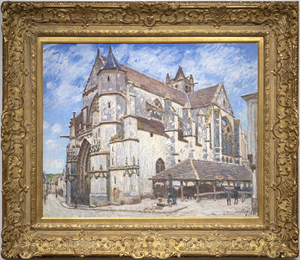
Between Île-de-France and Burgundy and on the edge of the Fontainebleau Forest lies the medieval village of Moret-sur-Loing, established in the 12th century. When Alfred Sisley described its character to Monet in a letter dated 31 August 1881 as “a chocolate-box landscape…” he meant it as a memento of enticement; that its keep, the ramparts, the church, the fortified gates, and the ornate facades nestled along the river were, for a painter, a setting of unmatched charm. An ancient church, always the most striking townscape feature along the Seine Valley, would be a presence in Sisley’s townscape views as it was for Corot, and for Monet at Vétheuil. But unlike Monet whose thirty views of Rouen Cathedral were executed so he could trace the play of light and shadow across the cathedral façade and capture the ephemeral nature of moment-to-moment changes of light and atmosphere, Sisley set out to affirm the permanent nature of the church of Notre-Dame at Moret-sur-Loing.  Monet’s sole concern was air and light, and Sisley’s appears to be an homage keepsake. The painting exudes respect for the original architects and builders of a structure so impregnable and resolute, it stood then as it did in those medieval times, and which for us, stands today, as it will, for time immemorial.
<br>
<br>Nevertheless, Sisley strived to show the changing appearance of the motif through a series of atmospheric changes. He gave the works titles such as “In Sunshine”, “Under Frost”, and “In Rain” and exhibited them as a group at the Salon du Champ-de-Mars in 1894, factors that suggest he thought of them as serial interpretations. Nevertheless, unlike Monet’s work, l’église de Moret, le Soir reveals that Sisley chose to display the motif within a spatial context that accentuates its compositional attributes — the plunging perspective of the narrow street at left, the strong diagonal recession of the building lines as a counterbalance to the right, and the imposing weight of the stony building above the line of sight.

ALFRED SISLEY

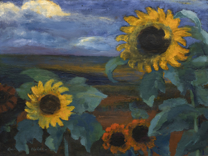
Trained as a woodcarver, Emil Nolde was almost 30 years old before he made his first paintings. The early paintings resembled his drawings and woodcuts: grotesque figures with bold lines and strong contrasts. The style was new, and it inspired the nascent movement Die Brücke (The Bridge), whose members invited Nolde to join them in 1906.  But, it was not until the garden became his locus operandi by 1915 that he built upon his mastery of contrasting luminosities to focus on color as the supreme means of expression.  Later, Nolde claimed “color is strength, strength is life,” and he could not have better characterized why his flower paintings reinvigorate our perception of color.
<br>
<br>Much of the strength of Nolde’s dramatic, Wagnerian-like color sensibilities is the effect of staging primary colors, such as the deep reds and golden yellows of Sonnenblumen, Abend II, against a somber palette. The contrast highlights and deepens the luminosity of the flowers, not just visually, but emotionally as well. In 1937, when Nolde’s art was rejected, confiscated, and defiled, his paintings were paraded as “degenerate art” throughout Nazi Germany in dimly lit galleries. Despite that treatment, Nolde’s status as a degenerate artist gave his art more breathing space because he seized the opportunity to produce more than 1,300 watercolors, which he called “unpainted pictures.” No novice in handling watercolor, his free-flowing style of painting had been a hallmark of his highly-charge, transparent washes since 1918. Sonnenblumen, Abend II, painted in 1944, is a rare wartime oil. He let his imagination run wild with this work, and his utilization of wet-on-wet techniques heightened the drama of each petal.
<br>
<br>Nolde’s intense preoccupation with color and flowers, particularly sunflowers, reflects his continuing devotion to van Gogh.  He was aware of van Gogh as early as 1899 and, during the 1920s and early 1930s, visited several exhibitions of the Dutch artist’s work.  They shared a profound love of nature. Nolde’s dedication to expression and the symbolic use of color found fullness in the sunflower subject, and it became a personal symbol for him, as it did for Van Gogh.

EMIL NOLDE

In 1955, Sir John Rothenstein, representing the Trustees of the Tate Museum, approached Winston Churchill about donating one of his paintings "as a gift to the nation."  Churchill was flattered, but felt he did not deserve such an honor as an artist.  Eventually, Churchill agreed and sent two candidate paintings to the Tate – On the Rance and Loup River.  No record exists regarding his own thoughts on the works he submitted, but one can safely say that Churchill thought highly of On the Rance, especially since it was not one of the paintings Rothenstein identified as a strong option. Loup River, which clearly matched Rothenstein's taste, was selected.  Not only was On the Rance not returned, but somehow it ended up, without any inventory record, in a basement storeroom at the Tate. In the storeroom it sat for almost a half century, when it was discovered by an intern.  The Churchill family was notified and eventually the painting was auctioned in June 2005, where it set a new auction record for Churchill's work, despite the lot notes hardly touching on the Tate’s possible acquisition. In a letter to the buyers, Churchill’s daughter, Lady Soames, summarized what had occurred in somewhat more detail.
<br>
<br>St. Malo is a walled city in Brittany, France on the coast of the English Channel. The city was nearly destroyed by bombings during WWII.

SIR WINSTON CHURCHILL

Alexander Calder executed a surprising number of oil paintings during the second half of the 1940s and early 1950s. By this time, the shock of his 1930 visit to Mondrian’s studio, where he was impressed not by the paintings but by the environment, had developed into an artistic language of Calder’s own. So, as Calder was painting The Cross in 1948, he was already on the cusp of international recognition and on his way to winning the XX VI Venice Biennale’s grand prize for sculpture in 1952. Working on his paintings in concert with his sculptural practice, Calder approached both mediums with the same formal language and mastery of shape and color.
<br>
<br>Calder was deeply intrigued by the unseen forces that keep objects in motion. Taking this interest from sculpture to canvas, we see that Calder built a sense of torque within The Cross by shifting its planes and balance. Using these elements, he created implied motion suggesting that the figure is pressing forward or even descending from the skies above. The Cross’s determined momentum is further amplified by details such as the subject’s emphatically outstretched arms, the fist-like curlicue vector on the left, and the silhouetted serpentine figure.
<br>
<br>Calder also adopts a strong thread of poetic abandon throughout The Cross’s surface. It resonates with his good friend Miró’s hieratic and distinctly personal visual language, but it is all Calder in the effective animation of this painting’s various elements. No artist has earned more poetic license than Calder, and throughout his career, the artist remained convivially flexible in his understanding of form and composition. He even welcomed the myriad interpretations of others, writing in 1951, “That others grasp what I have in mind seems unessential, at least as long as they have something else in theirs.”
<br>
<br>Either way, it is important to remember that The Cross was painted shortly after the upheaval of the Second World War and to some appears to be a sobering reflection of the time. Most of all, The Cross proves that Alexander Calder loaded his brush first to work out ideas about form, structure, relationships in space, and most importantly, movement.

ALEXANDER CALDER

During the early 1870s, Winslow Homer frequently painted scenes of country living near a small farm hamlet renowned for generations for its remarkable stands of wheat, situated between the Hudson River and the Catskills in New York state. Today Hurley is far more famous for inspiring one of Homer’s greatest works, Snap the Whip painted the summer of 1872. Among the many other paintings inspired by the region, Girl Standing in the Wheatfield is rich in sentiment, but not over sentimentalized. It directly relates to an 1866 study painted in France entitled, In the Wheatfields, and another, painted the following year after he returned to America. But Homer would have undoubtedly been most proud of this one. It is a portrait, a costume study, a genre painting in the great tradition of European pastoral painting, and a dramatically backlit, atmospheric tour de force steeped in the quickly fading gloaming hour light buoyed with lambent, flowery notes and wheat spike touches. In 1874, Homer sent four paintings to the National Academy of Design exhibition. One was titled, “Girl”. Might it not be this one?

WINSLOW HOMER

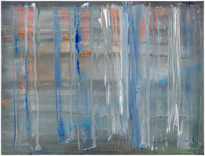
Widely recognized as one of the most consequential artists of our time, Gerhard Richters career now rivals that of Picasso's in terms of productivity and genius. The multi-faceted subject matter, ranging from slightly out-of-focus photographic oil paintings to Kelly-esque grid paintings to his "squeegee" works, Richter never settles for repeating the same thought- but is constantly evolving his vision. Richter has been honored by significant retrospective exhibitions, including the pivotal 2002 show,  "Gerhard Richter: Forty Years of Painting," at the Museum of Modern Art, New York.  
<br>
<br>"Abstraktes Bild 758-2" (1992) comes from a purely abstract period in Richter's work- where the message is conveyed using a truly physical painting style, where applied paint layers are distorted with a wooden "Squeegee" tool. Essentially, Richter is sculpting the layers of paint, revealing the underlayers and their unique color combinations; there is a degree of "art by chance". If the painting does not work, Richter will move on- a method pioneered by Jackson Pollock decades earlier.  
<br>
<br>Richter is included in prominent museums and collections worldwide, including the Tate, London, The Museum of Modern Art, New York, and the San Francisco Museum of Modern Art, among many others.

GERHARD RICHTER

The frame of reference for Irish American Sean Scully’s signature blocks and stripes is vast. From Malevich’s central premise that geometry can provide the means for universal understanding to Rothko’s impassioned approach to color and rendering of the dramatic sublime, Scully learned how to condense the splendor of the natural world into simple modes of color, light, and composition. Born in Dublin in 1945 and London-raised, Scully was well-schooled in figurative drawing when he decided to catch the spirit of his lodestar, Henri Matisse, by visiting Morocco in 1969. He was captivated by the dazzling tessellated mosaics and richly dyed fabrics and began to paint grids and stipes of color. Subsequent adventures provided further inspiration as the play of intense light on the reflective surfaces of Mayan ruins and the ancient slabs of stone at Stonehenge brought the sensation of light, space, and geometric movement to Scully’s paintings. The ability to trace the impact of Scully’s travels throughout his paintings reaffirms the value of abstract art as a touchstone for real-life experience.
<br>
<br>
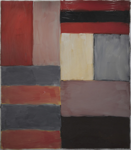
<br>Painted in rich, deep hues and layered, nuanced surfaces, Grey Red is both poetic and full of muscular formalism. Scully appropriately refers to these elemental forms as ‘bricks,’ suggesting the formal calculations of an architect. As he explained, “these relationships that I see in the street doorways, in windows between buildings, and in the traces of structures that were once full of life, I take for my work. I use these colors and forms and put them together in a way that perhaps reminds you of something, though you’re not sure of that” (David Carrier, Sean Scully, 2004, pg. 98). His approach is organic, less formulaic; intuitive painter’s choices are layering one color upon another so that contrasting hues and colors vibrate with subliminal energy. Diebenkorn comes to mind in his pursuit of radiant light. But here, the radiant bands of terracotta red, gray, taupe, and black of Grey Red resonate with deep, smoldering energy and evoke far more affecting passion than you would think it could impart. As his good friend, Bono wrote, “Sean approaches the canvas like a kickboxer, a plasterer, a builder. The quality of painting screams of a life being lived.”

SEAN SCULLY

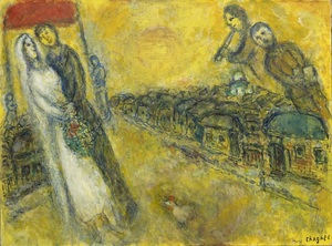
The world of Marc Chagall cannot be contained or limited by the labels we attach to it. It is a world of images and meanings which form their own splendidly mystical discourse. Les Mariés sous le baldaquin (The Bride and Groom under the Canopy) was begun as the artist entered his 90th year, a man who had known tragedy and strife, but who never forgot life’s moments of rapturous pleasure. Here, the dreamy delights of a Russian village wedding with its arrangements of well-worn attendees are brought to us with such happy wit and cheerful innocence that there is no resisting its charm. Using a golden toned emulsion combining oil and opaque, water-based gouache, the warmth, happiness, and optimism of Chagall’s usual positivism is wrapped in a luminous radiance suggesting the influence of gold-leaf religious icons or early Renaissance painting that sought to impart the impression of divine light or spiritual enlightenment. Using a combination of oil and gouache can be challenging. But here, in Les Mariés sous le baldaquin, Chagall employs it to give the scene an otherworldly quality, almost as if it has just materialized out of his mind’s eye. Its textural delicacy creates the impression that light is emanating from the work itself and gives a spectral quality to the figures floating the sky.

MARC CHAGALL

In 1945, with the war ended and Churchill having suffered a surprising defeat in the general election, he accepted an invitation from Field Marshall Sir Harold Alexander to join him at his Italian villa on the shore of Lake Como. Churchill enjoyed his host's generous hospitality and focused his attention and energy on capturing the region on canvas. He produced fifteen paintings, which embody how painting absorbed his attention and offered an elixir that helped him recharge. This iconic painting was featured in a January 1946 article in LIFE, and has been selected as a color illustration in multiple editions of Churchill’s book, Paintings as a Pastime.

SIR WINSTON CHURCHILL

<div>Painted from an unusually high vantage, “Riviera Coast Scene” vividly conveys the formidable distance and breadth of the scene from the perch where he set his easel.  Interestingly, Paul Rafferty did not include this painting in his book Winston Churchill: Painting on the French Riviera, believing it could likely be a scene from the Italian Lake District, where Churchill also painted in the same time period.  Paintings by Churchill can function as a glimpse into his extensive travels and his colorful life. Churchill most likely painted “Riviera Coast Scene” during a holiday at Chateau de l’Horizon, home of Maxine Elliot, a friend of his mother. Elliot, originally from Rockland, Maine, was a successful actress and socialite.  Within this painting, we see the influence of the Impressionists who utilized unusual viewpoints, modeled after Japanese woodblock prints, but also evidence of their attempts to push the boundaries of the landscape genre.</div>

SIR WINSTON CHURCHILL

Tom Wesselmann will undoubtedly be remembered for associating his erotic themes with the colors of the American flag. But Wesselmann had considerable gifts as a draftsman, and the line was his principal preoccupation, first as a cartoonist and later as an ardent admirer of Matisse. That he also pioneered a method of turning drawings into laser-cut steel wall reliefs proved a revelation. He began to focus ever more on drawing for the sake of drawing, enchanted that the new medium could be lifted and held: “It really is like being able to pick up a delicate line drawing from the paper.”
<br>
<br>The Steel Drawings caused both excitement and confusion in the art world. After acquiring one of the ground-breaking works in 1985, the Whitney Museum of American Art wrote Wesselmann wondering if it should be cataloged as a drawing or a sculpture. The work had caused such a stir that when Eric Fischl visited Wesselmann at his studio and saw steel-cut works for the first time, he remembered feeling jealous. He wanted to try it but dared not. It was clear: ‘Tom owned the technique completely.’
<br>
<br>Wesselmann owed much of that technique to his year-long collaboration with metalwork fabricator Alfred Lippincott. Together, in 1984 they honed a method for cutting the steel with a laser that provided the precision he needed to show the spontaneity of his sketches. Wesselmann called it ‘the best year of my life’, elated at the results that he never fully achieved with aluminum that required each shape be hand-cut.  “I anticipated how exciting it would be for me to get a drawing back in steel. I could hold it in my hands. I could pick it up by the lines…it was so exciting…a kind of near ecstasy, anyway, but there’s really been something about the new work that grabbed me.”
<br>
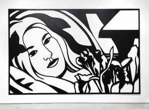
<br>Bedroom Brunette with Irises is a Steel Drawing masterwork that despite its uber-generous scale, utilizes tight cropping to provide an unimposing intimacy while maintaining a free and spontaneous quality. The figure’s outstretched arms and limbs and body intertwine with the petals and the interior elements providing a flowing investigative foray of black lines and white ‘drop out’ shapes provided by the wall. It recalls Matisse and any number of his reclining odalisque paintings. Wesselmann often tested monochromatic values to discover the extent to which color would transform his hybrid objects into newly developed Steel Drawing works and, in this case, continued with a color steel-cut version of the composition Bedroom Blonde with Irises (1987) and later still, in 1993 with a large-scale drawing in charcoal and pastel on paper.

TOM WESSELMANN

Located on the French Riviera between Nice and Monte Carlo, the Bay of Eze is renowned for its stunning location and spectacular views. As you can see on pages 80-81 of Rafferty's book, this painting skillfully captures the dizzying heights, set just west of Lou Sueil, the home of Jacques and Consuelo Balsan, close friends of Winston and Clementine.
<br> 
<br>The painting manipulates perspective and depth, a nod to the dramatic shifts of artists including Monet and Cézanne, who challenged traditional vantage points of landscapes. The portrait (i.e. vertical) orientation of the canvas combined with the trees, and the rhyming coastline channels the viewer’s gaze. The perceived tilting of the water's plane imbues the painting with dynamic tension.

SIR WINSTON CHURCHILL

It is not difficult to grasp how Robert Indiana’s brilliant two-row arrangement of four letters came to help empower a movement during the 1960s. Its origin emerged from deeply felt exposure to religion and from friend and mentor Ellsworth Kelly, whose hard-edged style and sensuous, unaccented color made a lasting impression. But as Indiana exclaimed, it was a moment of kismet that just happened when “LOVE bit me!” and the design came to him sharp and focused. Indiana, of course, put the design through many paces, and then the logo began to sprout up everywhere. The message, best conveyed in sculpture, stands in cities worldwide and has been translated into several languages, not least of which, is its Italian iteration, “Amor” with its fortuitous “O” also tilted to the right. But rather than being kicked by the foot of the “L”, this version lends a beautifully staged teetering effect to the “A” above. It gives a new, but no less profound, impression of love and its emotionally charged nature.  In either case, Love’s tilted “O” imparts instability to an otherwise stable design, a profound projection of Indiana’s implicit critique of “the often-hollow sentimentality associated with the word, metaphorically suggesting unrequited longing and disappointment rather than saccharine affection” (Robert Indiana’s Best: A Mini Retrospective, New York Times, May 24, 2018). Repetition, of course has a nasty habit of dampening our appreciation for the genius of simplicity and, groundbreaking design. Late in life, Indiana lamented that “it was a marvelous idea, but also terrible mistake. It became too popular. And there are people who don’t like popularity.” But we, denizens of a world fraught with divisiveness and caught in turmoil, thank you. “Love” and its many versions are strong reminders of our capacity for love, and that is our best everlasting hope for a better future.

ROBERT INDIANA

<div>Still lifes like<em> Oranges and Lemons (C 455) </em>give us an insight to the rich and colorful life of Churchill, just as his landscapes and seascapes do. Churchill painted <em>Oranges and Lemons</em> at La Pausa. Churchill would often frequent La Pausa as the guest of his literary agent, Emery Reves and his wife, Wendy.  Reves purchased the home from Coco Chanel.  While other members of the Churchill family did not share his enthusiasm, Churchill and his daughter Sarah loved the place, which Churchill affectionately called “LaPausaland”.  To avoid painting outside on a chilly January morning, Wendy Reves arranged the fruit for Churchill to paint. Surrounded by the Reves’s superb collection of Impressionist and Post-Impressionist works, including a number of paintings by Paul Cézanne, Oranges and Lemons illuminates Churchill’s relationships and the influence of Cézanne, who he admired. The painting, like Churchill, has lived a colorful life, exhibited at both the 1959 Royal Academy of Art exhibition of his paintings and the 1965 New York World’s Fair.</div>

SIR WINSTON CHURCHILL

The Pop Art Movement is notable for its rewriting of Art History and the idea of what could be considered a work of art. Larry Rivers association with Pop-Art and the New York School set him aside as one of the great American painters of the Post-War period.  
<br>
<br>In addition to being a visual artist, Larry Rivers was a jazz saxophonist who studied at the Juilliard School of Music from 1945-1946. This painting's subject echoes the artists' interest in Jazz and the musical scene in New York City, particularly Greenwich Village and the Lower East Side.  
<br>
<br>“Untitled” (1958) is notable bas the same owner has held it since the work was acquired directly from the artist several decades ago. This work is from the apex of the artists' career in New York and could comfortably hang in a museum's permanent collection.

LARRY RIVERS

Uniquely among Winston Churchill’s known work, “Coastal Town on the Riviera” is in fact a double painting with the landscape on one side and an oil sketch on the other. The portrait sketch bears some resemblance to Viscountess Castlerosse who was a frequent guest in the same Rivera estates where Churchill visited. Churchill painted her in C 517 and C 518 and gives us a larger picture of the people who inhabited his world. 
<br>
<br>Of his approximately 550 works, the largest portion (about 150) were of the South of France, where Churchill could indulge in both the array of colors to apply to his canvas and in gambling, given the proximity of Monte Carlo.

SIR WINSTON CHURCHILL

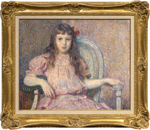
Théo van Rysselberghe’s Portrait de Sylvie Lacombe, painted in 1906, is a classic masterwork by one of the most refined and consistent portrait painters of his time. The color is harmonious, the brushwork vigorous and tailored to its material task, her body and countenance true and revealing. The sitter is the daughter of his good friend, the painter Georges Lacombe, who shared a close association with Gauguin, and was a member of Les Nabis with artists Bonnard, Denis, and Vuillard, among others. We now know about Sylvie Lacombe because Van Rysselberghe is so skilled at rendering subtle facial expressions and through careful observation and attention to detail, provided insights into her inner world. He has chosen a direct gaze, her eyes to yours, an inescapable covenant between subject and viewer regardless of our physical relationship to the painting. Van Rysselberghe had largely abandoned the Pointillist technique when he painted this portrait. But he continued to apply color theory guidelines by using tints of red — pinks and mauves — against greens to create a harmonious ameliorated palette of complementary colors to which he added a strong accent to draw the eye – an intensely saturated, red bow asymmetrically laid to the side of her head.

THÉO VAN RYSSELBERGHE