Back

ROBERT INDIANA (1928-2018)

 
It is not difficult to grasp how Robert Indiana’s brilliant two-row arrangement of four letters came to help empower a movement during the 1960s. Its origin emerged from deeply felt exposure to religion and from friend and mentor Ellsworth Kelly, whose hard-edged style and sensuous, unaccented color made a lasting impression. But as Indiana exclaimed, it was a moment of kismet that just happened when “LOVE bit me!” and the design came to him sharp and focused. Indiana, of course, put the design through many paces, and then the logo began to sprout up everywhere. The message, best conveyed in sculpture, stands in cities worldwide and has been translated into several languages, not least of which, is its Italian iteration, “Amor” with its fortuitous “O” also tilted to the right. But rather than being kicked by the foot of the “L”, this version lends a beautifully staged teetering effect to the “A” above. It gives a new, but no less profound, impression of love and its emotionally charged nature.  In either case, Love’s tilted “O” imparts instability to an otherwise stable design, a profound projection of Indiana’s implicit critique of “the often-hollow sentimentality associated with the word, metaphorically suggesting unrequited longing and disappointment rather than saccharine affection” (Robert Indiana’s Best: A Mini Retrospective, New York Times, May 24, 2018). Repetition, of course has a nasty habit of dampening our appreciation for the genius of simplicity and, groundbreaking design. Late in life, Indiana lamented that “it was a marvelous idea, but also terrible mistake. It became too popular. And there are people who don’t like popularity.” But we, denizens of a world fraught with divisiveness and caught in turmoil, thank you. “Love” and its many versions are strong reminders of our capacity for love, and that is our best everlasting hope for a better future. It is not difficult to grasp how Robert Indiana’s brilliant two-row arrangement of four letters came to help empower a movement during the 1960s. Its origin emerged from deeply felt exposure to religion and from friend and mentor Ellsworth Kelly, whose hard-edged style and sensuous, unaccented color made a lasting impression. But as Indiana exclaimed, it was a moment of kismet that just happened when “LOVE bit me!” and the design came to him sharp and focused. Indiana, of course, put the design through many paces, and then the logo began to sprout up everywhere. The message, best conveyed in sculpture, stands in cities worldwide and has been translated into several languages, not least of which, is its Italian iteration, “Amor” with its fortuitous “O” also tilted to the right. But rather than being kicked by the foot of the “L”, this version lends a beautifully staged teetering effect to the “A” above. It gives a new, but no less profound, impression of love and its emotionally charged nature.  In either case, Love’s tilted “O” imparts instability to an otherwise stable design, a profound projection of Indiana’s implicit critique of “the often-hollow sentimentality associated with the word, metaphorically suggesting unrequited longing and disappointment rather than saccharine affection” (Robert Indiana’s Best: A Mini Retrospective, New York Times, May 24, 2018). Repetition, of course has a nasty habit of dampening our appreciation for the genius of simplicity and, groundbreaking design. Late in life, Indiana lamented that “it was a marvelous idea, but also terrible mistake. It became too popular. And there are people who don’t like popularity.” But we, denizens of a world fraught with divisiveness and caught in turmoil, thank you. “Love” and its many versions are strong reminders of our capacity for love, and that is our best everlasting hope for a better future. It is not difficult to grasp how Robert Indiana’s brilliant two-row arrangement of four letters came to help empower a movement during the 1960s. Its origin emerged from deeply felt exposure to religion and from friend and mentor Ellsworth Kelly, whose hard-edged style and sensuous, unaccented color made a lasting impression. But as Indiana exclaimed, it was a moment of kismet that just happened when “LOVE bit me!” and the design came to him sharp and focused. Indiana, of course, put the design through many paces, and then the logo began to sprout up everywhere. The message, best conveyed in sculpture, stands in cities worldwide and has been translated into several languages, not least of which, is its Italian iteration, “Amor” with its fortuitous “O” also tilted to the right. But rather than being kicked by the foot of the “L”, this version lends a beautifully staged teetering effect to the “A” above. It gives a new, but no less profound, impression of love and its emotionally charged nature.  In either case, Love’s tilted “O” imparts instability to an otherwise stable design, a profound projection of Indiana’s implicit critique of “the often-hollow sentimentality associated with the word, metaphorically suggesting unrequited longing and disappointment rather than saccharine affection” (Robert Indiana’s Best: A Mini Retrospective, New York Times, May 24, 2018). Repetition, of course has a nasty habit of dampening our appreciation for the genius of simplicity and, groundbreaking design. Late in life, Indiana lamented that “it was a marvelous idea, but also terrible mistake. It became too popular. And there are people who don’t like popularity.” But we, denizens of a world fraught with divisiveness and caught in turmoil, thank you. “Love” and its many versions are strong reminders of our capacity for love, and that is our best everlasting hope for a better future. It is not difficult to grasp how Robert Indiana’s brilliant two-row arrangement of four letters came to help empower a movement during the 1960s. Its origin emerged from deeply felt exposure to religion and from friend and mentor Ellsworth Kelly, whose hard-edged style and sensuous, unaccented color made a lasting impression. But as Indiana exclaimed, it was a moment of kismet that just happened when “LOVE bit me!” and the design came to him sharp and focused. Indiana, of course, put the design through many paces, and then the logo began to sprout up everywhere. The message, best conveyed in sculpture, stands in cities worldwide and has been translated into several languages, not least of which, is its Italian iteration, “Amor” with its fortuitous “O” also tilted to the right. But rather than being kicked by the foot of the “L”, this version lends a beautifully staged teetering effect to the “A” above. It gives a new, but no less profound, impression of love and its emotionally charged nature.  In either case, Love’s tilted “O” imparts instability to an otherwise stable design, a profound projection of Indiana’s implicit critique of “the often-hollow sentimentality associated with the word, metaphorically suggesting unrequited longing and disappointment rather than saccharine affection” (Robert Indiana’s Best: A Mini Retrospective, New York Times, May 24, 2018). Repetition, of course has a nasty habit of dampening our appreciation for the genius of simplicity and, groundbreaking design. Late in life, Indiana lamented that “it was a marvelous idea, but also terrible mistake. It became too popular. And there are people who don’t like popularity.” But we, denizens of a world fraught with divisiveness and caught in turmoil, thank you. “Love” and its many versions are strong reminders of our capacity for love, and that is our best everlasting hope for a better future. It is not difficult to grasp how Robert Indiana’s brilliant two-row arrangement of four letters came to help empower a movement during the 1960s. Its origin emerged from deeply felt exposure to religion and from friend and mentor Ellsworth Kelly, whose hard-edged style and sensuous, unaccented color made a lasting impression. But as Indiana exclaimed, it was a moment of kismet that just happened when “LOVE bit me!” and the design came to him sharp and focused. Indiana, of course, put the design through many paces, and then the logo began to sprout up everywhere. The message, best conveyed in sculpture, stands in cities worldwide and has been translated into several languages, not least of which, is its Italian iteration, “Amor” with its fortuitous “O” also tilted to the right. But rather than being kicked by the foot of the “L”, this version lends a beautifully staged teetering effect to the “A” above. It gives a new, but no less profound, impression of love and its emotionally charged nature.  In either case, Love’s tilted “O” imparts instability to an otherwise stable design, a profound projection of Indiana’s implicit critique of “the often-hollow sentimentality associated with the word, metaphorically suggesting unrequited longing and disappointment rather than saccharine affection” (Robert Indiana’s Best: A Mini Retrospective, New York Times, May 24, 2018). Repetition, of course has a nasty habit of dampening our appreciation for the genius of simplicity and, groundbreaking design. Late in life, Indiana lamented that “it was a marvelous idea, but also terrible mistake. It became too popular. And there are people who don’t like popularity.” But we, denizens of a world fraught with divisiveness and caught in turmoil, thank you. “Love” and its many versions are strong reminders of our capacity for love, and that is our best everlasting hope for a better future. It is not difficult to grasp how Robert Indiana’s brilliant two-row arrangement of four letters came to help empower a movement during the 1960s. Its origin emerged from deeply felt exposure to religion and from friend and mentor Ellsworth Kelly, whose hard-edged style and sensuous, unaccented color made a lasting impression. But as Indiana exclaimed, it was a moment of kismet that just happened when “LOVE bit me!” and the design came to him sharp and focused. Indiana, of course, put the design through many paces, and then the logo began to sprout up everywhere. The message, best conveyed in sculpture, stands in cities worldwide and has been translated into several languages, not least of which, is its Italian iteration, “Amor” with its fortuitous “O” also tilted to the right. But rather than being kicked by the foot of the “L”, this version lends a beautifully staged teetering effect to the “A” above. It gives a new, but no less profound, impression of love and its emotionally charged nature.  In either case, Love’s tilted “O” imparts instability to an otherwise stable design, a profound projection of Indiana’s implicit critique of “the often-hollow sentimentality associated with the word, metaphorically suggesting unrequited longing and disappointment rather than saccharine affection” (Robert Indiana’s Best: A Mini Retrospective, New York Times, May 24, 2018). Repetition, of course has a nasty habit of dampening our appreciation for the genius of simplicity and, groundbreaking design. Late in life, Indiana lamented that “it was a marvelous idea, but also terrible mistake. It became too popular. And there are people who don’t like popularity.” But we, denizens of a world fraught with divisiveness and caught in turmoil, thank you. “Love” and its many versions are strong reminders of our capacity for love, and that is our best everlasting hope for a better future. It is not difficult to grasp how Robert Indiana’s brilliant two-row arrangement of four letters came to help empower a movement during the 1960s. Its origin emerged from deeply felt exposure to religion and from friend and mentor Ellsworth Kelly, whose hard-edged style and sensuous, unaccented color made a lasting impression. But as Indiana exclaimed, it was a moment of kismet that just happened when “LOVE bit me!” and the design came to him sharp and focused. Indiana, of course, put the design through many paces, and then the logo began to sprout up everywhere. The message, best conveyed in sculpture, stands in cities worldwide and has been translated into several languages, not least of which, is its Italian iteration, “Amor” with its fortuitous “O” also tilted to the right. But rather than being kicked by the foot of the “L”, this version lends a beautifully staged teetering effect to the “A” above. It gives a new, but no less profound, impression of love and its emotionally charged nature.  In either case, Love’s tilted “O” imparts instability to an otherwise stable design, a profound projection of Indiana’s implicit critique of “the often-hollow sentimentality associated with the word, metaphorically suggesting unrequited longing and disappointment rather than saccharine affection” (Robert Indiana’s Best: A Mini Retrospective, New York Times, May 24, 2018). Repetition, of course has a nasty habit of dampening our appreciation for the genius of simplicity and, groundbreaking design. Late in life, Indiana lamented that “it was a marvelous idea, but also terrible mistake. It became too popular. And there are people who don’t like popularity.” But we, denizens of a world fraught with divisiveness and caught in turmoil, thank you. “Love” and its many versions are strong reminders of our capacity for love, and that is our best everlasting hope for a better future. It is not difficult to grasp how Robert Indiana’s brilliant two-row arrangement of four letters came to help empower a movement during the 1960s. Its origin emerged from deeply felt exposure to religion and from friend and mentor Ellsworth Kelly, whose hard-edged style and sensuous, unaccented color made a lasting impression. But as Indiana exclaimed, it was a moment of kismet that just happened when “LOVE bit me!” and the design came to him sharp and focused. Indiana, of course, put the design through many paces, and then the logo began to sprout up everywhere. The message, best conveyed in sculpture, stands in cities worldwide and has been translated into several languages, not least of which, is its Italian iteration, “Amor” with its fortuitous “O” also tilted to the right. But rather than being kicked by the foot of the “L”, this version lends a beautifully staged teetering effect to the “A” above. It gives a new, but no less profound, impression of love and its emotionally charged nature.  In either case, Love’s tilted “O” imparts instability to an otherwise stable design, a profound projection of Indiana’s implicit critique of “the often-hollow sentimentality associated with the word, metaphorically suggesting unrequited longing and disappointment rather than saccharine affection” (Robert Indiana’s Best: A Mini Retrospective, New York Times, May 24, 2018). Repetition, of course has a nasty habit of dampening our appreciation for the genius of simplicity and, groundbreaking design. Late in life, Indiana lamented that “it was a marvelous idea, but also terrible mistake. It became too popular. And there are people who don’t like popularity.” But we, denizens of a world fraught with divisiveness and caught in turmoil, thank you. “Love” and its many versions are strong reminders of our capacity for love, and that is our best everlasting hope for a better future. It is not difficult to grasp how Robert Indiana’s brilliant two-row arrangement of four letters came to help empower a movement during the 1960s. Its origin emerged from deeply felt exposure to religion and from friend and mentor Ellsworth Kelly, whose hard-edged style and sensuous, unaccented color made a lasting impression. But as Indiana exclaimed, it was a moment of kismet that just happened when “LOVE bit me!” and the design came to him sharp and focused. Indiana, of course, put the design through many paces, and then the logo began to sprout up everywhere. The message, best conveyed in sculpture, stands in cities worldwide and has been translated into several languages, not least of which, is its Italian iteration, “Amor” with its fortuitous “O” also tilted to the right. But rather than being kicked by the foot of the “L”, this version lends a beautifully staged teetering effect to the “A” above. It gives a new, but no less profound, impression of love and its emotionally charged nature.  In either case, Love’s tilted “O” imparts instability to an otherwise stable design, a profound projection of Indiana’s implicit critique of “the often-hollow sentimentality associated with the word, metaphorically suggesting unrequited longing and disappointment rather than saccharine affection” (Robert Indiana’s Best: A Mini Retrospective, New York Times, May 24, 2018). Repetition, of course has a nasty habit of dampening our appreciation for the genius of simplicity and, groundbreaking design. Late in life, Indiana lamented that “it was a marvelous idea, but also terrible mistake. It became too popular. And there are people who don’t like popularity.” But we, denizens of a world fraught with divisiveness and caught in turmoil, thank you. “Love” and its many versions are strong reminders of our capacity for love, and that is our best everlasting hope for a better future. It is not difficult to grasp how Robert Indiana’s brilliant two-row arrangement of four letters came to help empower a movement during the 1960s. Its origin emerged from deeply felt exposure to religion and from friend and mentor Ellsworth Kelly, whose hard-edged style and sensuous, unaccented color made a lasting impression. But as Indiana exclaimed, it was a moment of kismet that just happened when “LOVE bit me!” and the design came to him sharp and focused. Indiana, of course, put the design through many paces, and then the logo began to sprout up everywhere. The message, best conveyed in sculpture, stands in cities worldwide and has been translated into several languages, not least of which, is its Italian iteration, “Amor” with its fortuitous “O” also tilted to the right. But rather than being kicked by the foot of the “L”, this version lends a beautifully staged teetering effect to the “A” above. It gives a new, but no less profound, impression of love and its emotionally charged nature.  In either case, Love’s tilted “O” imparts instability to an otherwise stable design, a profound projection of Indiana’s implicit critique of “the often-hollow sentimentality associated with the word, metaphorically suggesting unrequited longing and disappointment rather than saccharine affection” (Robert Indiana’s Best: A Mini Retrospective, New York Times, May 24, 2018). Repetition, of course has a nasty habit of dampening our appreciation for the genius of simplicity and, groundbreaking design. Late in life, Indiana lamented that “it was a marvelous idea, but also terrible mistake. It became too popular. And there are people who don’t like popularity.” But we, denizens of a world fraught with divisiveness and caught in turmoil, thank you. “Love” and its many versions are strong reminders of our capacity for love, and that is our best everlasting hope for a better future.
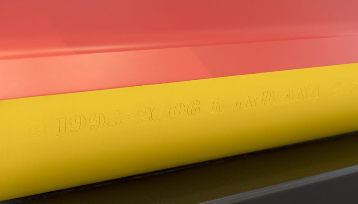
AMOR (Red Yellow)1998-200696 x 96 x 48 in.(243.84 x 243.84 x 121.92 cm) polychrome aluminum
Provenance
Private Collection, Zurich
Exhibition
Robert Indiana, outdoor exhibition at Paseo del Prado, Madrid 2006,  full page in situ illustration on cover and  p. 46, 47
Robert Indiana, outdoor exhibition at Gran Vía, Bilbao 2007, p. 43, full page in situ illustration p. 42 and double page in situ illustration p. 44-45
Robert Indiana, outdoor exhibition at Gran Vía, Valencia 2007, p. 47, full page in situ illustration on cover and p. 46, 47
Robert Indiana a Milano, Padglione di Arte Contemporanea, Milan 2008, p. 40, full page in situ ill
...More...ustrations p. 41-53, color illustration p. 134
Robert Indiana: Beyond Love, Whitney Museum of American Art, New York 2013, no. 140, p. 132, 251, 252, full page color illustration p. 148
Robert Indiana, Pinacoteca Comunale Casa Rusca, Locarno 2017, full page color illustration
Literature
Simon Salama-Caro, Joachim Pissarro, John Wilmerding, Robert Pincus-Witten, Robert Indiana, Rizzoli, New York 2006, p. 168, 291, 293, full page in situ illustration p. 169
Der amerikanische Maler der Zeichen / American Painter of Signs - Robert Indiana, Museum Kurhaus Kleve, Kleve 2007, p. 26-27
Robert Indiana: To Russia with Love, State Russian Museum, St. Petersburg 2016, p. 123, full page color illustration p. 122
...LESS... Price900,000
Inquire


“Some people like to paint trees. I like to paint love. I find it more meaningful than painting trees.” – Robert Indiana

History

It is not difficult to grasp how Robert Indiana’s brilliant two-row arrangement of four letters came to help empower a movement during the 1960s. Its origin emerged from deeply felt exposure to religion and from friend and mentor Ellsworth Kelly, whose hard-edged style and sensuous, unaccented color made a lasting impression. But as Indiana exclaimed, it was a moment of kismet that just happened when “LOVE bit me!” and the design came to him sharp and focused. Indiana, of course, put the design through many paces, and then the logo began to sprout up everywhere. The message, best conveyed in sculpture, stands in cities worldwide and has been translated into several languages, not least of which, is its Italian iteration, “Amor” with its fortuitous “O” also tilted to the right. But rather than being kicked by the foot of the “L”, this version lends a beautifully staged teetering effect to the “A” above. It gives a new, but no less profound, impression of love and its emotionally charged nature.  In either case, Love’s tilted “O” imparts instability to an otherwise stable design, a profound projection of Indiana’s implicit critique of “the often-hollow sentimentality associated with the word, metaphorically suggesting unrequited longing and disappointment rather than saccharine affection” (Robert Indiana’s Best: A Mini Retrospective, New York Times, May 24, 2018). Repetition, of course has a nasty habit of dampening our appreciation for the genius of simplicity and, groundbreaking design. Late in life, Indiana lamented that “it was a marvelous idea, but also terrible mistake. It became too popular. And there are people who don’t like popularity.” But we, denizens of a world fraught with divisiveness and caught in turmoil, thank you. “Love” and its many versions are strong reminders of our capacity for love, and that is our best everlasting hope for a better future.

  • Robert Indiana with “Love” sculpture, Photograph: Jack Mitchell, Credit: Getty Images
  • Robert Indiana with his “LOVE” sculpture in Central Park, New York City in 1971
  • Indiana with Love 2
    Robert Indiana with his “LOVE” sculpture
  • Robert Indiana, in his studio in Vinalhaven, ME., in 2008
“It would be my intention that everybody should have love, and there are a lot of people in the world.” – Robert Indiana

MARKET INSIGHTS

AMR Robert Indiana market graph October 1985 to March 2023
  • Indiana’s market has seen a 10.5% compound annual growth rate since 1976.
  • Eight of his top ten sales at auction are works featuring the Love motif.
  • Four of his top ten sales at auction are sculptures, like Amor.

Comparable Sculptures Sold at Auction

“Love” red/blue (1990), painted aluminum, 144 x 144 inches. Sold at Christie’s New York: 12 May, 2011 for $4,114,500.
“Love” (1998), painted aluminum, 144 x 144 inches. Sold at Christie’s New York: 14 November, 2007 for $3,513,000.
“One Through Zero” (The ten Numbers) (2003), polychrome aluminum, in ten parts, 33 x 33 inches. Sold at Sotheby’s New York: 15 November 2019 for $2,060,000.
“Love” (1998), polychromed aluminum, 96 x 96 inches. Sold at Christie’s New York: 16 November 2018 for $1,872,500.
“Love” (blue/red)(1998), polychrome Aluminum, 96 x 96 inches. Sold at Sotheby’s New York: 14 November, 2012 for $1,706,500.

Sculptures in Museum Collections

“AMOR” (2006), polychrome aluminum, 96 x 96 x 48 in., National Gallery of Art, Washington, DC
“AMOR” (1998), polychrome aluminum, 72 x 72 x 36 in., Philadelphia Museum of Art, Philadelphia, Pennsylvania
“AMOR” (1998-2006), polychrome aluminum painted, 96 x 96 x 48 in., Yorkshire Sculpture Park, Wakefield, England
“A six foot sculpture is OK, but when they get bigger, they get more exciting” – Robert Indiana

Additional Resources

Hear the story behind this Latin/Spanish version of the artist’s iconic LOVE sculpture.
ARTINFO’s Benjamin Genocchio traveled to speak with Robert Indiana at his home in Vinalhaven, Maine.
“AMOR” by Robert Indiana – Museum Without Walls™:
AMOR by Robert Indiana at the National Gallery Sculpture Garden.

Authentication

Simon Salama-Caro, Joachim Pissarro, John Wilmerding, Robert Pincus-Witten, Robert Indiana, Rizzoli, New York 2006, p. 168, 291, 293, full page in situ illustration p. 169.

View excerpt

Inquire

Inquire - Art Single

Other Works by Robert Indiana

You May Also Like